
Process Mapping & Documentation
Process Map Symbols: The Small Set You Actually Need
By Derek Coffey · August 29, 2026
Process map symbols are the standard shapes that tell a reader what each box is doing: an oval starts and ends the process, a rectangle is a step, a diamond is a decision, a document shape is paperwork, and arrows carry the work between them. Your mapping tool will offer dozens more. Almost every business process map needs six, and the skill is in refusing the rest.
What do process map symbols mean?
Each symbol answers one question about the box it wraps: is this work, a choice, a record, a beginning, or a stop? Shapes let a reader skim the structure of a process before reading a word of it.
Which means the reason to use standard shapes is not compliance. It is speed of correction.
The person who does the work has to look at your diagram and disagree with it out loud. If they have to decode your notation first, they will nod politely and keep doing the job their own way. The complete guide to process mapping for small business covers the session that produces a map worth correcting.
The six shapes that carry almost every business map
Six symbols cover almost everything a business map has to say, and this is the whole vocabulary.
| Symbol | What it looks like | What it means |
|---|---|---|
| Start | Rounded oval | The trigger that begins the process |
| Step | Rectangle | One action, one owner |
| Decision | Diamond | A fork with labeled exits |
| Document | Rectangle with a wavy base | A form, invoice, or record |
| Handoff | Arrow crossing a lane line | Work changing hands |
| End | Rounded oval | The condition that means done |
Start and end share a shape on purpose, because what separates them is the label. Nothing here describes a system, a department, or a delay. Those belong on the map as text inside a shape or as a lane name.
If a shape does not change what the reader does next, leave it off the map.
Start, step, decision, document, handoff, end
A process does not begin when somebody arrives at work. It begins when a specific thing happens: a call lands, a job closes out, a Monday arrives. Name that trigger in the first oval and the finish condition in the last, because "done" is not a finish condition. "Invoice paid" is.
Steps take one verb and one owner. If a step needs the word "and" to describe it, you have two steps. The glance test: a reader looks at a box and knows what to do.
The diamond is the hardest shape to fill in
A diamond marks a fork where the right answer depends on context, so it needs a question inside it and labeled exits leaving it. If you cannot write the exits, you have not found a decision. You have found an argument.
We mapped a field services company where the box everyone called "confirm payment" turned out to be a diamond. Card payments hit the CRM the same second, while cash and check jobs cannot be trusted until somebody chases the deposit. So "is this job paid" was a judgment call living in nobody's document, and a step two people perform differently is not a step. It is a decision nobody wrote down.
The handoff arrow is where the map earns its keep
The handoff is the one item here that is not really a shape: it is an arrow crossing from one lane into another, and it earns symbol status because the crossing is where work dies. Our maps exist to capture who does what, where the handoffs happen, and where knowledge sits in a single point of failure.
At one company running on more than twenty group chat threads, the bookkeeper reprocessed hundreds of messages to find who worked a job. On a map, that is an arrow landing in a thread nobody owns. Swimlane diagrams built around handoffs are what we reach for when more than two roles touch a process.
The document shape marks the form or invoice being handed over, which is where a written procedure has to exist. The map points at it; documenting business processes step by step fills it in.
Color and lane conventions that make a map readable
Color is the fastest signal on a map and the easiest one to waste. Most maps we are asked to repair use six colors that mean nothing.
One color means exactly one thing, and the meaning is written on the map.
Pick a small palette and hold it: one neutral for ordinary steps, one accent for decisions, and one color for boxes only one person can perform, because those become the knowledge risk assessment we hand back with the diagram.
Lanes follow the same restraint: one per role rather than per department, one for software only when it performs work, and an order that follows the flow. If you are still choosing a canvas, process mapping software worth paying for comes down to whether you can lock a shape library and share a read-only view.
Do you need BPMN?
No, not for an internal map your own team will read. BPMN, Business Process Model and Notation, is a formal standard built for handing a diagram to a developer, an auditor, or a workflow engine with no chance to ask you a question.
That precision costs vocabulary. Gateways, events, timers, and message flows carry rules about how they combine, and a reader who does not know them will read your map wrong while feeling certain they read it right.
Use BPMN when a developer or an auditor must read the map without you in the room, and skip it when your own team is the audience.
The symbols people add that make maps worse
The failure is almost never too few symbols. It is a map so decorated that the person it was drawn for stops trying. Here is what we strip out.
- Database cylinders and server icons on every system touch
- Off-page connectors chained across five linked pages
- Subprocess markers hiding the exact part everyone argues about
- Gateways and events borrowed from BPMN into a plain flowchart
Every one was added by somebody trying to be more accurate, and each produced a diagram only its author can read.
Every shape you add is one more thing a reader has to learn before they can tell you that you got it wrong.
We watched this at a nonprofit where a workflow tool went unused because it was too complicated for the people it was bought for. Show the primary path, gate the depth behind a link, and do not walk anyone through every field or their minds spin.
Set your conventions once and reuse them
Our house standard is a documented shape and color library in Lucidchart that every client map is built from. It is not sophisticated. It is written down, which is the whole advantage, because the second map never contradicts the first.
Yours fits on one page: which six shapes, which colors and what each means, lane order, how steps are labeled (verb plus object), and how decisions are labeled (a question plus named exits). Anything not on that page stays off the map.
Write the convention down once, and open that file before you start the next map.
Teams mapping their own processes without a consultant skip this step more than any other, and it is the cheapest one.
The sweep every map should pass before you share it
We do not count a map as delivered until it passes a fixed set of checks, so run these five before it leaves your screen.
- Label every step with a verb. A box reading "invoices" tells a reader nothing. "Send invoice to client" does.
- Give every diamond labeled exits. An unlabeled fork is where two employees quietly choose differently.
- Name every handoff owner. Each crossing needs a name on both ends, and if the receiving end is a group chat, write that down, because that is the finding.
- Delete the orphans. A shape with no arrow in or out is a missing connection or a step nobody performs.
- Read it back. The instruction we give every expert says it all: we want you to say no, it does not look like that, I am actually doing this.
Only that last check finds what you got wrong. In one nonprofit's documentation wave, people learned mid-session that colleagues ran the same process differently, and had never known it.
A map is finished when the person who does the work can find their own day in it.
At The Systems Effect we build these maps in Lucidchart alongside a knowledge risk assessment of where a business is most exposed if one person leaves. What you do with the map after it exists decides whether the afternoon was worth it.
Do one thing this week. Open your most recent map and check that every diamond has both exits labeled. Each one that does not is a decision running on somebody's memory.
Frequently Asked Questions
What do the shapes in a process map mean?
Each shape tells the reader what kind of thing a box is. A rounded oval is a start or an end, a rectangle is a step, a diamond is a decision, and a rectangle with a wavy base is a document. An arrow crossing from one lane into another is a handoff.
What is the diamond in a flowchart?
The diamond is a decision point: a fork where the right answer depends on context rather than following from the step before it. It holds a question, and every path leaving it carries the answer that sends work down that path. If you cannot label the exits, you have an unresolved disagreement rather than a decision.
Do you need to follow BPMN standards?
No, not for internal maps your own team will read. BPMN earns its extra vocabulary when a developer, an auditor, or a workflow engine has to read the diagram with nobody there to explain it. Six shapes and a written convention carry almost every small business map.
How many symbols should a business process map use?
Six covers nearly every business process: start, step, decision, document, handoff, and end. The test for adding a seventh is whether it changes what a reader does next, because precision no reader uses costs legibility and buys nothing.
What makes a process map hard to read?
Too many shapes, colors that mean nothing, unlabeled decision exits, and detail hidden behind subprocess markers. Maps also go unread when a manager draws one from memory instead of building it with the person doing the work.
Keep reading

Every Task Needs an Owner and Someone Who Notices
Responsible and accountable are two different jobs on the same task. One person does the work, a second person is answerable for noticing when it did not happen, and the gap between them is where small businesses lose things.
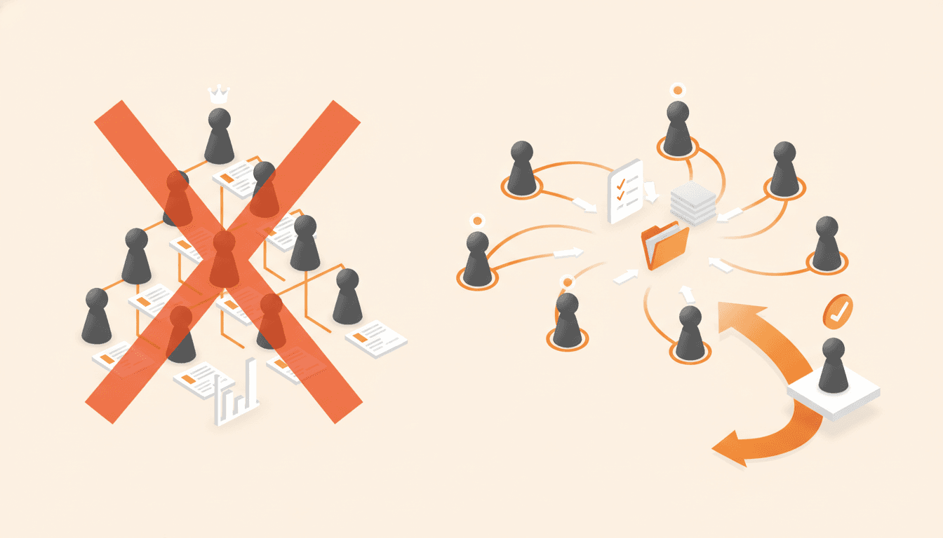
Your Org Chart Is Not How the Work Happens
An org chart shows reporting lines, not who owns the work, which is why systems built off the boxes end up documenting titles. Here is how to map roles and responsibilities starting from the work itself.

Swimlane Diagrams: How to Map Handoffs Between Departments
A swimlane diagram puts every step in the lane of whoever performs it, so the handoffs between departments finally become visible. Here is how to set up the lanes and write a rule for every crossing.
Get one role out of one person's head in 14 days.
The interview guide, knowledge map and SOP templates we use on paid engagements. Free as Google Docs and Sheets.